
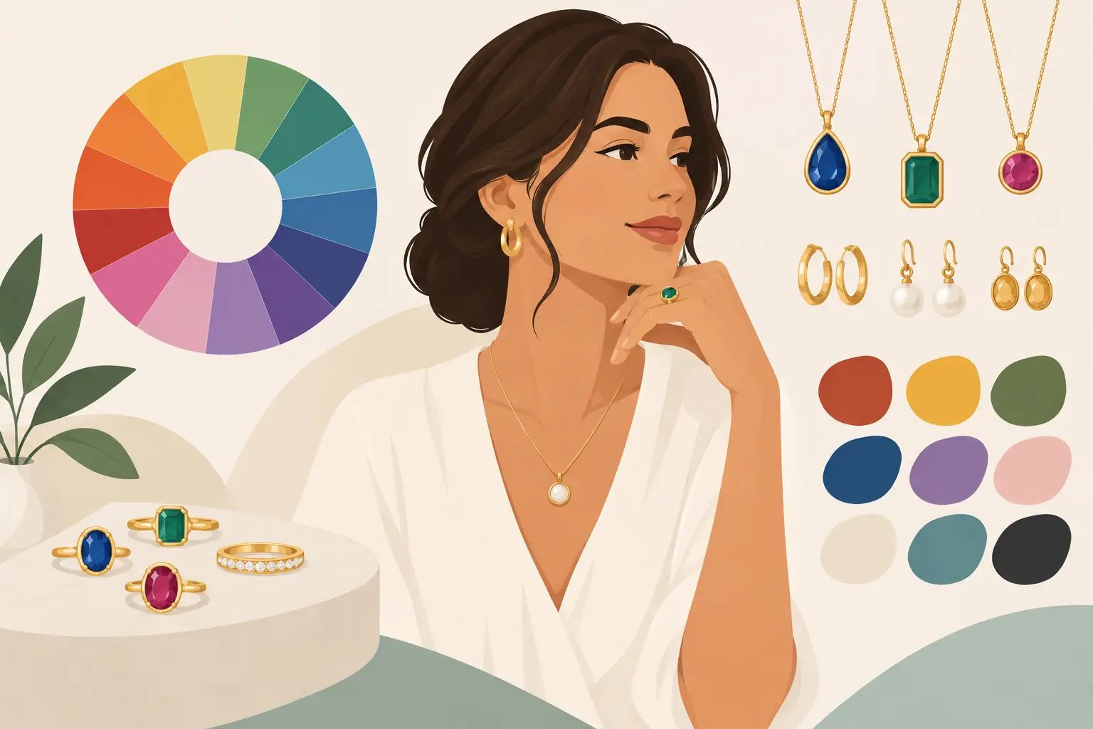
A pair of turquoise earrings can make a plain white tee feel joyful. A deep wine-red necklace can turn a simple black dress into something memorable. That is the everyday magic of jewelry color theory: choosing shades that do more than match an outfit. They create a feeling, highlight your features, and help your personal style look beautifully intentional.
For handmade jewelry lovers, color is never just decoration. It is part of the story. It can feel earthy and free-spirited, polished and dramatic, soft and romantic, or wonderfully unexpected. Whether you are choosing a statement pair for yourself, shopping for a meaningful gift, or designing your own beaded piece, a little color knowledge makes every choice more confident.
What Jewelry Color Theory Really Means
Color theory is simply the way colors relate to one another. The familiar color wheel gives us a helpful starting point: primary colors create secondary colors, while neighboring and opposite shades offer different kinds of harmony.
In jewelry, though, the goal is not to follow a rulebook. The goal is to understand why one combination feels calm while another feels energetic. A bracelet with ocean blue, seafoam green, and silver has a peaceful, coastal mood because those hues sit close together. Earrings that pair violet with golden yellow feel lively because the colors are opposites, creating contrast that catches the eye.
Handmade jewelry has a special advantage here. Beads, polymer clay, stones, metals, and tiny accent details can bring several colors together without looking flat. A design can include a bold focal color, a supporting shade, and one quiet neutral that gives the eye a place to rest.
Start With the Mood You Want to Wear
Before reaching for the color wheel, think about the feeling you want your jewelry to create. This is often more useful than asking whether every shade perfectly matches.
Warm colors such as coral, amber, tomato red, mustard, and orange usually feel sunny, spirited, and expressive. They are wonderful for statement earrings, boho bracelets, and accessories that add life to neutral outfits. Cool colors like cobalt, teal, lavender, emerald, and icy blue can feel refreshing, calm, elegant, or mysterious depending on their depth.
Neutrals deserve more credit than they get. Cream, black, gray, tan, brown, pearl white, and metallics help colorful pieces feel wearable. A rich mix of clay beads may look even more artful when it includes a touch of ivory or matte gold. Neutrals do not have to be boring. They are often what makes a bright color feel polished enough for everyday wear.
If you love a playful style, try a palette that feels like a favorite place or memory. Think desert clay, turquoise, and brass for a warm Southwest-inspired look. Think blush pink, berry, and pearl for a sweet gift-worthy set. The best palettes often have emotion behind them.
Jewelry Color Theory and Your Natural Coloring
There is no requirement to choose jewelry according to skin tone, hair color, or eye color. Wear the shade that makes you happy. Still, understanding contrast can help when you want a piece to feel especially flattering near your face.
People with warm undertones often enjoy jewelry in gold, copper, olive, coral, warm turquoise, cream, and honey-toned shades. Cool undertones may be drawn to silver, blue-based reds, cobalt, emerald, violet, and crisp white. Neutral undertones can usually wear a wide range of colors, making mixed-metal and multicolor designs especially fun.
Your features can also guide the amount of contrast you choose. If you have dark hair and fair skin, high-contrast earrings in black and white or jewel tones may look striking. If your coloring is softer, muted shades such as dusty rose, sage, mocha, and pale aqua can create a lovely, blended effect.
But this is a suggestion, not a limitation. A bright yellow pair of earrings can be exactly the confidence boost a cool-toned person wants. Jewelry is personal adornment, not a test with a right answer.
Use Eye Color as a Playful Starting Point
Choosing a color that echoes your eyes can create an especially thoughtful look. Blue eyes often sparkle beside copper, coral, warm brown, or deep navy. Green and hazel eyes can look beautiful with plum, berry, rust, and mossy green. Brown eyes have incredible range and can be highlighted by cobalt, teal, gold, amethyst, or warm pink.
You do not need an exact match. In fact, contrast often creates more impact than matching. A pair of amber earrings beside blue eyes, for example, can make both colors appear brighter.
Three Color Pairings That Always Have Personality
Some combinations make choosing easy because they naturally create a clear visual mood.
Analogous colors sit beside one another on the color wheel, such as teal, blue, and violet or coral, peach, and yellow. These palettes feel smooth and cohesive. They are a lovely choice for layered bracelets, beaded necklaces, and jewelry sets where you want several shades to work together quietly.
Complementary colors sit opposite each other, such as blue and orange, purple and yellow, or green and red. These pairings have energy. They work beautifully in statement earrings or a focal pendant, especially when one color takes the lead and the other appears in smaller accents.
Monochromatic palettes use different versions of one color. Picture pale pink, rose, and deep burgundy in one necklace, or a range of blues from soft sky to navy. This approach looks thoughtful and refined while still giving handmade designs depth.
A fourth option is the colorful neutral palette: choose one expressive shade and anchor it with black, ivory, tan, gray, or a metallic finish. A bold red clay earring with gold hardware, for instance, feels more balanced than an all-red design while keeping its confident personality.
Let Metal and Texture Join the Conversation
Metal color is part of your palette, not an afterthought. Gold-toned findings bring warmth to turquoise, olive, coral, terracotta, and rich browns. Silver can make blues, purples, cool pinks, and black look crisp and modern. Rose gold softens berry shades, blush tones, ivory, and muted greens.
Mixed metals can work, too, particularly in boho-inspired jewelry. The key is repetition. If a necklace has a brass focal charm and silver beads, include both metals more than once so the combination looks deliberate.
Texture changes how color reads. Glossy polymer clay can make saturated shades look bright and playful. Matte beads create a softer, earthier effect. Translucent beads let light become part of the design, while faceted beads add sparkle and movement. The same shade of green can feel completely different in a matte jade bead than in a shiny glass crystal.
Build a Wearable Palette for Your Jewelry Box
A thoughtfully chosen collection does not mean every piece has to match. It means your jewelry gives you easy options for the clothes you actually wear.
Start by noticing the colors already in your closet. If you reach for denim, white, black, and tan, colorful earrings in turquoise, coral, mustard, or emerald will have plenty of chances to shine. If your wardrobe leans toward jewel tones, consider metallics and softer accent colors that will not compete with your clothing.
It helps to have a few different color roles available: a neutral everyday piece, a bright statement piece, something warm, something cool, and one design that feels special enough for celebrations or gifts. A handcrafted set can be especially useful because a necklace and earrings in related colors look coordinated without feeling overly matched.
When shopping for someone else, pay attention to what they wear rather than what you would choose for them. A friend who lives in denim and linen may love earthy clay tones and simple gold details. Someone who enjoys bold prints may light up over colorful beaded earrings with a little unexpected contrast. The most meaningful jewelry feels like it saw the person wearing it.
Make Room for the Colors You Cannot Explain
Color theory gives you a foundation, but intuition is part of the design process, too. Maybe a combination reminds you of a garden after rain, a beach vacation, your grandmother’s favorite scarf, or the first cool day of fall. That emotional pull matters.
At Scott Jewelry Design, handmade accessories are meant to add a little art and confidence to ordinary moments. Choose the shades that make you pause, smile, and reach for them again. The right color is often the one that feels most like your own small celebration.


