A pair of earrings can be tiny and still say a lot. A sun-warmed terracotta arch feels grounded. A playful cobalt-and-lime pattern feels fearless. Soft sage with pearl details feels like a quiet favorite you reach for every week. That is what makes polymer clay color trends so exciting: color is not just decoration. It is often the first part of a handmade piece that feels like you.
For jewelry lovers, trends are most useful when they offer inspiration rather than rules. The best palette is still the one that fits your wardrobe, your mood, or the person you are shopping for. Right now, polymer clay jewelry is moving toward colors with warmth, personality, and enough versatility to make a handmade accessory feel special long after a seasonal moment has passed.
Polymer Clay Color Trends Are Becoming More Wearable
Bright statement colors will always have a place in artisan jewelry, especially when you want your earrings to start a conversation. The difference lately is how those shades are being styled. Instead of piling on every bold color at once, many designs pair one high-energy hue with a calm neutral, a soft pastel, or a metallic accent.
Think cherry red with creamy ivory, cobalt blue with sand, or citrus orange with a subtle touch of gold. These pairings let a colorful handmade design feel expressive without becoming hard to wear. They also give earrings and bracelets a little more flexibility. The same pair that adds joy to a simple white tee can still work with a printed dress or a favorite denim jacket.
There is a lovely shift happening away from colors that feel overly perfect or overly matched. Handmade jewelry looks especially beautiful when the palette has contrast, texture, and a sense of intention. A few speckles, a marbled surface, or a small unexpected color inside a pattern can make a familiar shape feel completely original.
The Colors Showing Up in Handmade Jewelry
Earthy shades with a sunlit feel
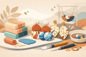
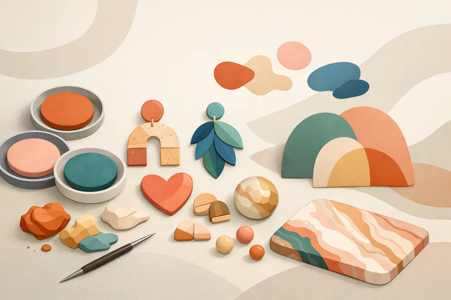
Warm earth tones continue to feel right at home in polymer clay. Terracotta, cinnamon, clay red, mustard, caramel, olive, and chocolate brown bring a cozy, boho-friendly energy to earrings and statement necklaces. These colors are easy to pair with linen, denim, knits, and floral prints, which makes them a smart choice for everyday accessories.
The freshest versions are not dull or heavy. Look for terracotta softened with blush, rich brown brightened by turquoise, or olive paired with a little peach. Those unexpected combinations keep an earthy palette from feeling too serious. They also celebrate the organic charm that draws so many people to handcrafted pieces in the first place.
Soft pastels with more depth
Pastel jewelry is no longer limited to spring. Powder blue, butter yellow, lilac, pale peach, and pistachio green are showing up in ways that feel sweet but grown-up. The key is choosing tones that have a little dustiness or warmth rather than a candy-store finish.
A muted lavender paired with deep plum feels artistic. Butter yellow with black-and-white checks feels cheerful and modern. Pale pink beside burgundy or espresso feels romantic without being overly precious. For gift giving, soft pastels are especially wonderful because they often feel approachable while still offering a pop of color.
Deep jewel tones for instant polish
Emerald, sapphire, amethyst, garnet, and teal bring a richer mood to polymer clay designs. These shades are ideal when you love the lightness of clay but want jewelry with a more dressed-up feel. Jewel tones work beautifully in simple silhouettes, where the color can be the main event.
A deep green drop earring can look striking with a black top, but it can also add life to a neutral outfit. Berry tones offer a similar kind of versatility, especially during fall and winter. If bold brights are not your usual choice, jewel tones can be a beautiful middle ground: colorful, confident, and easy to style.
Blue is still a favorite, just less predictable
Blue remains one of the most wearable colors in jewelry, but current palettes are reaching beyond basic navy. Cobalt, dusty denim, cornflower, sea glass, and inky blue-black each bring a different feeling. Cobalt is energetic and graphic. Denim blue is relaxed. Sea-glass shades feel light and beachy, while dark ink blue can feel almost like a neutral.
Blue also plays well with many other colors. Pair it with white or cream for a crisp look, rust for a warm contrast, or silver and pearl details for something a little more polished. For a handmade jewelry collection, blue offers plenty of room to experiment without losing everyday appeal.
Color Combinations Matter More Than One Trendy Shade
A single trendy color can catch the eye, but a thoughtful combination is what makes a piece memorable. Polymer clay gives makers the freedom to layer, swirl, speckle, and block colors in ways that are difficult to recreate with mass-produced materials. That is part of its magic.
High-contrast pairings are having a moment. Black with butter yellow, red with pale pink, and royal blue with orange create a lively graphic look. These combinations shine in playful shapes like flowers, abstract arches, checkered studs, and sculptural dangles. They are wonderful for someone who sees jewelry as a finishing touch and a little mood boost.
On the softer side, tone-on-tone palettes feel quietly luxurious. Consider warm beige, camel, and chocolate together, or several shades of green ranging from sage to moss. Monochromatic pieces are especially useful when you want texture or shape to stand out. A marbled finish, raised floral detail, or gentle shimmer can add dimension without asking the color palette to do too much.
How to Choose a Trend That Still Feels Like You
It depends on how you wear jewelry. If your closet is full of neutrals, you may love one bright pair of earrings that gives every outfit a spark. If you already enjoy colorful clothing, a softer clay palette might become the balancing accessory you wear most often. Trend-led jewelry should fit into your real life, not sit untouched because it feels too difficult to style.
Start with the colors you naturally reach for in clothing, makeup, handbags, or even home decor. Those are clues to the shades that make you feel comfortable and confident. Then look for a polymer clay design that adds either a complement or a contrast. Someone who wears lots of cream, denim, and olive may adore a rust-and-turquoise earring. Someone who loves black may find that cobalt, red, or emerald becomes a signature pop.
For gifts, think about personality before trying to guess a favorite color. A friend who loves gardening may enjoy leafy greens, floral pinks, or sunny yellow. A creative sister with a bold wardrobe may appreciate graphic color blocking. For someone whose style is classic, pearl white, soft black, navy, or a jewel-tone accent can feel thoughtful without being too risky.
Let Texture Change the Color Story
Polymer clay color is never only about the shade itself. The finish can make the same color read completely differently. Matte clay gives terracotta, sage, and dusty pink an earthy softness. A glossy topcoat can make bright colors feel playful and polished. Tiny flecks, mica shimmer, translucent layers, and marbling create depth that invites a closer look.
This is where handmade work shines. No two marbled patterns land exactly the same, and a hand-mixed color often carries subtle variations that make a piece feel alive. Those small differences are not flaws. They are reminders that someone shaped, baked, sanded, assembled, and finished the jewelry with care.
At Scott Jewelry Design, that care is part of the joy behind expressive accessories. A colorful pair of handmade earrings is not just following a palette. It is giving you a small, wearable piece of art that can brighten an ordinary day.
The most meaningful color trend is the one that makes you smile when you put it on. Choose the sunny yellow, the moody teal, the soft blush, or the rich terracotta that feels most like your own little spark of color.